For an e-commerce platform past a certain scale and size, having some sort of a dynamic UI system becomes a necessity due to the complexity of dealing with the real world and the sheer variety of physical products. It becomes even more complex at Carousell because of the following two reasons:
- Since Carousell is primarily a classifieds platform, many listings are user-generated (as opposed to being created by businesses/inventory managers) which means that standardization is an issue. Inventory management concepts such as SKU have limited bearing.
- Carousell doesn’t just deal with physical products — our ambition of becoming a marketplace platform means that we need to have the ability to support listings that are non-physical in nature, e.g. jobs, services, insurance.
In this 3-part series, we will talk about a dynamic, server-driven UI system we’ve built to cater for and scale along with our business needs. This first part will talk about some of the problems we faced before we had such a system. The second part will go into more depth about the system itself, and the final part will address some miscellaneous parts of the system in a Q&A format.
We hope this will be a useful reference for anyone who is either:
- wondering if they need a system like this at some point in the future, or
- already knows that they need a system like this and are looking for inspiration on how to start
Some time ago, when you wanted to list something for sale on Carousell, all you had to do was fill in 5 things:
- Pictures
- Category
- Title
- Description
- Asking price
And off you’d be to the races.
To everyone’s surprise, the real world wasn’t quite this simple. Having only the description meant that sellers had to get creative, using prior experience or guesswork to decide what information to fill in the title and description. New sellers who were not privy to the emergent behaviours of the dizzyingly busy marketplace would leave the platform disheartened, discouraged from not having their listings sell.
The problems didn’t end with our sellers. We found that high-intent buyers often needed to narrow down their search to listings matching some specific criteria. This behaviour was particularly evident in categories such as cars and properties, where the limitation of having only a textual search was thrown into sharp relief. Imagine a user searching for 4-room flats, where possible listing titles could look like this:
Super rare 4bedrm, walking dist to Bishan MRT
or
Cheap! 3+1 Blk 234 Toa Payoh St23
This user would not only have to search for the term “4-room flat”, but also terms like “4bedrm” or “3+1”. As you can imagine, this limitation was a show-stopper for many of the users who frequented these categories.
It was clear that we needed to be able to describe listings with more attributes than just a title and description. And it wasn’t just about solving these aforementioned problems too — having more structured data about listings would pave the way for more powerful data-driven features such as recommendation engines, suggestive sell forms, and adaptive search filters.
With dynamic data and attributes comes the need for dynamic UI. As it turns out, this would turn out to be an undertaking involving almost every part of the user experience. Let’s take a short walkthrough through some parts of the app that would be expected to change.
Sell form
As a user using Carousell, you’re either selling something or buying something. Let’s start with the process of how a listing is created.
As with the existing sell form, the user first uploads some pictures for the listing. after which the user is prompted to choose a category for the listing.
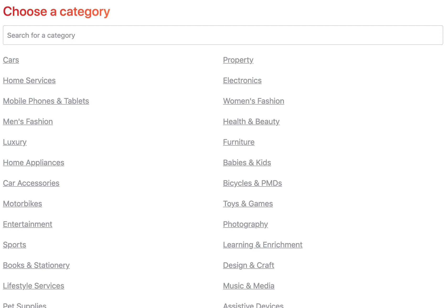
Depending on the category chosen, the user should be able to input information pertaining to that category. For example, if the user wants to list an iPhone, the sell form should contain fields prompting the user to enter information as storage size, or colour.
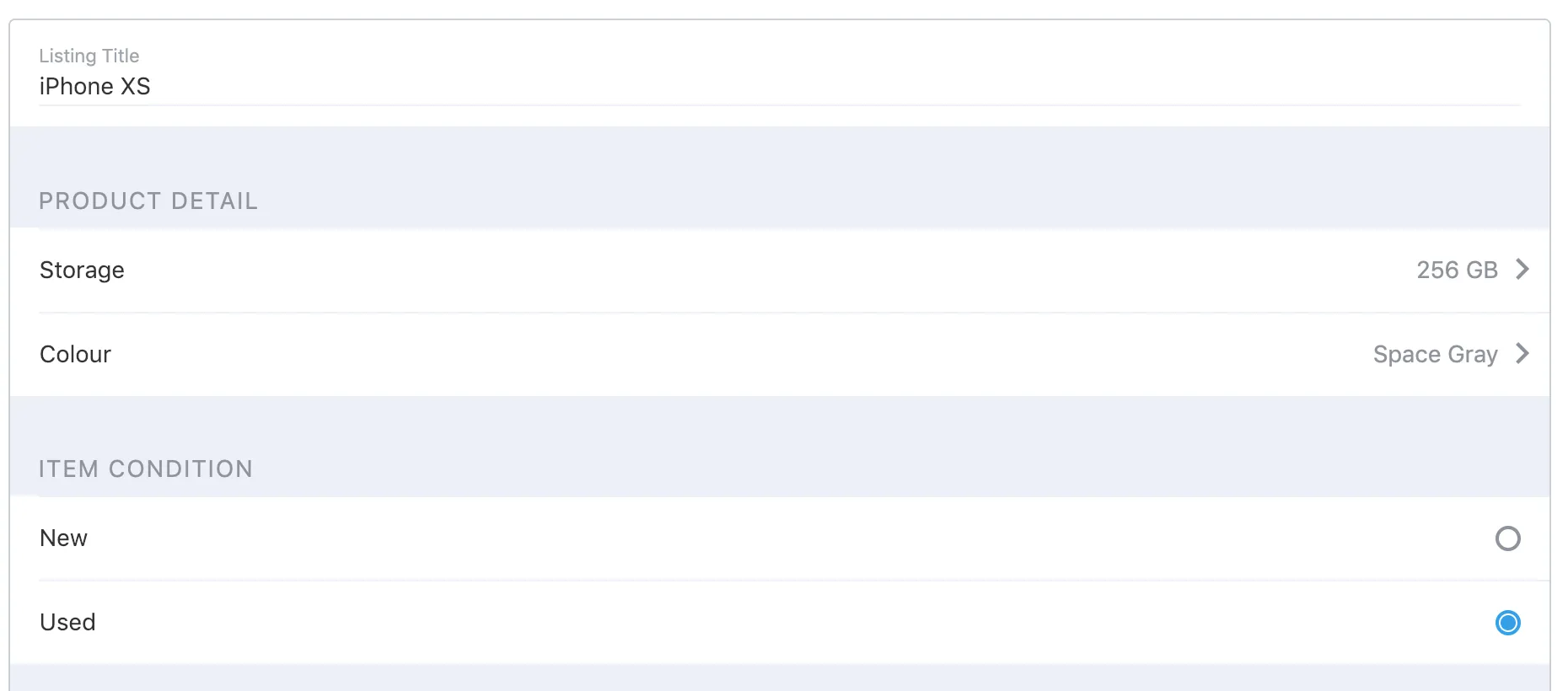
The form for a jobs listing should look different. Instead of fields for storage size and colour as in the sell form for iPhones, there should be fields for working hours, job requirements, base salary, and other such attributes.
Search filters and results
Once the user enters all of the details of a listing and posts it, prospective buyers should be able to search for it. Depending on each category the listing is in, buyers should be able to apply different filters, as indicated in the black box on the left in the screenshot below.


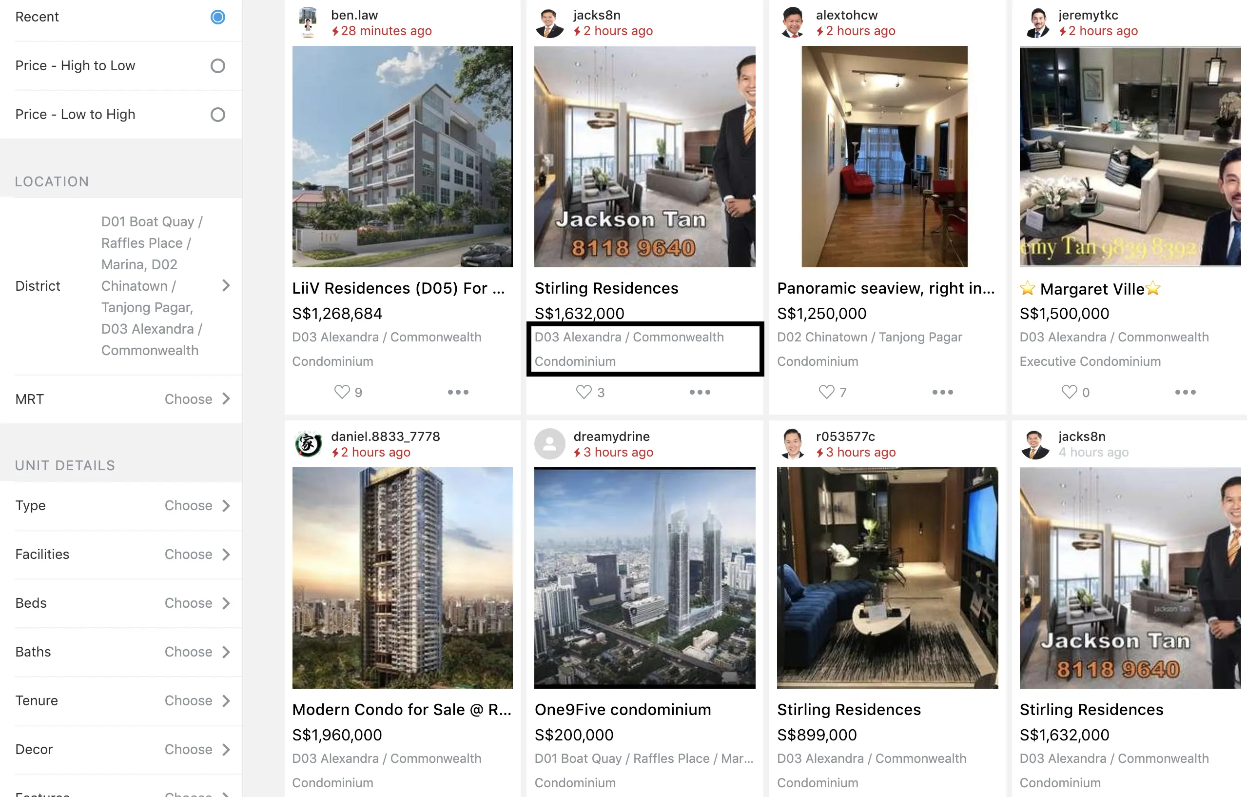
Aside from the search filters, note how subtitles (indicated by the black box above) display different information about the listing depending on which category the listing is in. In the iPhone category, listings are shown with an excerpt of the description as well as the stated condition of the iPhone, whereas in Properties, the district and the property type is shown.
Listing details
From the search results page, users who are interested in particular listings would click or tap on the listing to see more information. This brings them to what we call the listing details page.
In the listing details page, users should be able to see all of the listing’s information and attributes, like so:

We have thousands of categories which would potentially have to be (and are indeed) updated on a daily basis, so the ability to be able to create new categories and update existing ones without always having to push a client update is critical to business iteration.
The system that we’ve built to enable this level of dynamicity is powered by something called a fieldset. A fieldset is a document written in a specific format that allows clients to know what components to display and where. While this may sound similar to other more traditional markup languages like HTML, fieldsets differ in that it operates at a higher abstraction level. And while HTML and fieldsets are both declarative in nature, fieldsets can also specify component behaviour and data validations declaratively, something HTML alone cannot do.
Fieldsets are cross-platform, supporting clients uniformly across desktop/mobile web, iOS, and Android using the same language. Fieldsets achieve this by ceding control on platform specific issues such as visual design and layout to each platform’s implementation of the fieldset rendering engine, instead only controlling things that represent business concerns that are uniform across platforms.
We’ll take a closer look at fieldsets and all of these properties in the next section.